Button Types — Figma Buttons Types · every type ships default · hover · inactive · icons are placeholders (optional per action) · font weight is regular by default (semibold occasionally, bold rarely) and size/padding may vary by type
Every button set contains a: default · hover · inactive state. - Each button carries an icon placeholder before and after a modifiable label — icons and label can each be removed for mockups. - Any text style and any spacing token may be applied to the label. - Padding: most commonly 10/6 (h/v), also 20/10 and 10/10; small buttons 6/3. Internal gap is always 10 — except with 6/3 padding, where it's 6.

Theme mode toggle — light & dark — Figma Left Bar · the sun / moon control that switches the app theme. Two sizes: small (collapsed rail — a single icon button) and medium / extended (open rail — a labelled sun | moon segmented control). Each ships a light and a dark variant; the active side is filled.
Small · 40×40 icon button — a sun on the light variant, a moon on the dark, centered in the rail's icon gutter. Extended · a segmented pill (#F5F5F5 track on light, rgba(255,255,255,.07) on dark) holding labelled Light Mode / Dark Mode halves; the active theme's half is filled — white card + navy glyph & label on light, rgba(255,255,255,.16) + white on dark, the inactive half in muted text. Lives in the left bar: the small icon shows when the rail is collapsed, the labelled segmented control when it is open.
Dropdowns — option lists — Figma Drop Down Window + Option Label Buttons · the menu a filter or field opens · 39px rows on white, navy Open Sans 14 labels with an optional left icon · scroll bar only when the list overflows · an optional “Add Another Option” footer that can swap into an inline editor
A floating panel: 300px wide, 10px radius, white fill, soft 5/5/10 · 10% shadow. Every choice is a 39px row split by a #BFBFBF hairline, with a navy #172E55 label in Open Sans 14 indented past an optional left icon (~16px, a placeholder that may be removed). Rows light green #117F39 with white content on hover; disabled is #E0E0E0 content on white.
Rule — opening position. A drop down always opens 3px below its trigger button, overlaid on whatever sits beneath it — never inserted in flow, so opening it never resizes its host window. Canonical hooks: .dd-anchor on the trigger wrapper, .dd-pop on the drop down.
#D1D5DD fill, Navy-500 #172E55 hover / selected · scroll bar: track Navy-300, thumb Navy-100#117F39) · Inactive (faded #E0E0E0). The left icon is an optional placeholder.#BFBFBF text field with green confirm and red cancel; the red cancel reverts it back to the Add Another Option row.Radio buttons — Figma Radio Buttons · single-choice control · seven colors × Default / Hover / Selected / Selected·Hover · Desktop 22px, Mobile 18px
A radio is a 1px ring. Default shows the ring only; Selected adds a filled center dot (~64% of the ring); Hover grows the ring by 2px (2224 desktop). It ships in seven colors so it can sit on any surface — Inactive #E0E0E0 is the disabled look, and Gold / White-Filled sets the gold ring on an opaque white disc for use over imagery or wherever the control overlaps another element and must not show through.
Desktop 22px ring · 1px stroke · 14px dot · Mobile 18px ring · 11.5px dot · hover grows the ring +2px. Colors: Black #000000 · White #FFFFFF · Gray #8E8E8E · Pure Blue #172E55 · Gold #DCCAAF · Inactive #E0E0E0 · Gold / White-Filled (gold ring on #FFFFFF). The global-header Purchase / Lease toggle uses the 18px Gold radio.
Checkboxes — Figma Checkbox · 17px square, 5px radius, 1px stroke · Is Active × Is Checked · five colors
Two booleans drive the look. Is Active is the engaged/emphasis state — resting draws the box in muted #E0E0E0 gray; active draws it in the chosen color. Is Checked toggles the checkmark. So: resting-empty = gray outline active-empty = colored outline checked & resting = gray outline + gray check (no fill) checked & active = solid fill + check. The Black variant is the default form checkbox and fills green #117F39 when checked (success confirmation); light fills (White, Gold) take a dark check for contrast.
Box 17px · radius 5 · 1px stroke. Resting outline #E0E0E0 (both empty & checked). Active outline = color. Checked-active fill: Black#117F39 (white check) · Blue#172E55 (white) · Gray#999999 (white) · White#FFFFFF (#8E8E8E check) · Gold#DCCAAF (#172E55 check).
Toggles — Figma Toggle · four types · Desktop + Mobile · Active (enabled) & Inactive (disabled)
A pill track with a sliding knob. Active (enabled) shows live colors — navy #172E55 ON, gray #BFBFBF OFF; Inactive (disabled) is a muted #E0E0E0 track with a #D0D0D0 outline. Knob is always white (except the gold-BG variant). Four types:
1 · Two options (Yes / No)
 No · off
 Yes · on
 No · inactive
 Yes · inactive
49×22 desktop · 35×18 mobile
2 · Three options (Yes / Partial / No)
 No · left
 Partial · center
 Yes · right
 No · inactive
 Partial · inactive
 Yes · inactive
60×22 · Partial = white track, navy outline + centered navy knob
3 · Show / Hide (visibility)
 Hide · off
 Show · on
 Show · gold BG
 Hide · inactive
 Show · inactive
37×19 · gold track + eye glyph · Gold BG = white track + gold knob, for toggles sitting on a gold-filled frame
4 · Log-in required (locked)
 No · locked
 Yes · locked
 No · inactive
 Yes · inactive
Knob carries a lock glyph — gates a setting behind sign-in
Track: ON #172E55 · OFF #BFBFBF · disabled #E0E0E0+#D0D0D0 outline · Show #DCCAAF · knob white (gold #DCCAAF on the Gold-BG variant). Desktop knob r8 (r6.5 Show) · mobile pill 35×18, knob r6.
Option selector — Figma 2–5 Options Text · pick one of up to five mutually-exclusive options · Large ⁄ Small · plus AM ⁄ PM and ON ⁄ OFF presets (45×23 ⁄ 47×23 · Open Sans 8 bold · 5px radiuses · horizontal or vertical)
A compact segmented control. A white #BFBFBF-outlined full-radius pill holds 2–5 segments; the chosen one is a Navy #172E55 inset pill with white text, the others are gray #8E8E8E. Inactive (disabled) swaps Navy #E0E0E0 and fades the idle labels. Horizontal fits full words; Vertical stacks the segments. The AM ⁄ PM and ON ⁄ OFF presets keep their 5px radiuses.
Search — selected-item chips “jelly beans” that sit on the left of the global search bar, one per active filter
When a user searches, each chosen entity is held as a chip on the left of the search bar — a white pill with a 1px navy #172E55 border, full radius, a type icon on the left that names what kind of thing was selected, and the selected value as label text in navy. A #BFBFBF / 10px vertical rule separates the chips from the placeholder. Ten types are defined; each has an Editable and a View state.
#DCCAAF circle removes the chip
Aa View (non-editable) — no cross; label becomes an underlined hyperlink to that record
| Type | Editable | View · links to |
|---|---|---|
| Defaultfallback · placeholder icon · no underline in view | ||
| Address | ||
| City | ||
| Zip | ||
| Neighborhood | ||
| County | ||
| State | ||
| Schooltwo segments · {Level} › {ISD} | ||
| ISDschool district | ||
| Userlinks to profile (if permitted) |
Every label shown in braces — {Address}, {City}, {First Name} {Last Name} … — is placeholder text standing in for the user’s actual selection. The type icon is fixed for every type except Default, whose icon is only a placeholder and may be dropped when no meaningful glyph applies.
Chip #FFFFFF fill · 1px #172E55 border · full radius · navy icon + label · remove control = white × on #DCCAAF circle (editable only) · view-mode label text-decoration:underline acting as a hyperlink — every type underlines in view except Default.
Header filter buttons — the main search filters, left of Adv. Filters & Save Search
Each main filter is a full-radius pill with two parts: a leading icon and a label naming the filter. The one exception is the first pill — Listing Statuses — which drops the label and instead shows a row of status icons, one disc per selected status.

Default #F2F2F2 fill · #BFBFBF border · near-black icon / label / chevron. Hover & Active #117F39 green fill, white content; the Active state adds a #ED1C24 remove badge that clears the filter. Inactive #F2F2F2 fill · #D0D0D0 border · #E0E0E0 faded content. Status discs sit on #E0E0E0 (inactive) or #DCCAAF gold with #172E55 glyphs (active). Each main filter opens a dropdown — documented next.
Filter — number selection — Figma Filters Number Selection · a small-number picker (< 10) for Beds, Baths, Stories, etc.
Picks a small count. A segmented control offers Any (green when selected) then 1+…5+. It renders in two contexts: as an opened main-filter popover on the header — with the gold caret, drop shadow, ⓘ + title, red close, and Clear ⁄ Done buttons — or bare (just the segmented control) inside the Advanced Filters window.
Segmented control · 5px radius · 32px tall · cells split by 1px #BFBFBF · selected cell green #117F39 + white, others white + black. Popover chrome (main-filter only): gold #DCCAAF caret + 42px header (ⓘ + title + red #ED1C24 close), down-right shadow, and a footer with Clear (red outline) + Done (green fill). Inside Advanced Filters the gold bar + white frame remain (without the red close, caret, shadow, or Clear ⁄ Done).
Filter — range — Figma Filters Range Options · a Min ⁄ Max range picker for prices, home size, lot size, etc.
Sets a range. Two type-in fields (Min ⁄ Max) sit above two scrollable columns of preset values — the left column feeds Min, the right feeds Max, one selectable per column (green when chosen). The preset columns are optional — the filter can show just the Min ⁄ Max fields. Shown as an opened main-filter popover (gold caret, ⓘ + title, red close, Clear ⁄ Done) and inside Advanced Filters, where the gold bar stays (without the red close) around the same white frame — minus the caret, shadow, and Clear ⁄ Done.
Min ⁄ Max fields · 6px radius · #BFBFBF border, joined by a short dash. Preset pills are the library’s Option Pills — full-radius · padding 10 ⁄ 6 · white + #BFBFBF border · hover border navy #172E55 · selected green #117F39 + white — one per column. On the header the popover adds the gold caret, red #ED1C24 close and a Clear ⁄ Done footer; inside Advanced Filters the gold bar + white frame remain but those extras drop. Preset values are placeholder text; the preset columns are optional and may be omitted.
Filter — simple selection — Figma Simple Selection · pick from a set of labelled option pills (e.g. Property Type, Open House)
Picks from a list of the library’s Option Pills (button set 10) — white with a #BFBFBF border; hover swaps the border to navy #172E55; selected fills green #117F39 with white text. The gold bar can carry an optional gray (Title Note) after the title — placeholder text for a secondary description; omit it when not needed. A See More link expands a long option list, and an italic Helper Text line can close the frame — both optional. As with the other filters: the main header instance adds the caret, shadow, red close and Clear ⁄ Done; inside Advanced Filters the gold bar (no red close) + white frame remain.
Pills are the Option Pills button set — full-radius · padding 10 ⁄ 6 · Open Sans 14 · white + 1px #BFBFBF border · hover border navy #172E55 · selected green #117F39 + white (border kept). (Title Note) Open Sans 14 #8E8E8E — placeholder for an optional secondary description. See More navy underlined link · Helper Text italic #8E8E8E — both optional. "Option Label" is placeholder text.
Filter — grouped options — Figma Grouped Options + Individual Options · icon-carrying options under a selectable group · sub-option rail & optional date strip per option · Desktop ⁄ Mobile · Active ⁄ Inactive
Groups related options in one frame. The Label Group tab (with its tooltip) rides the frame’s top edge next to a gold radio — clicking either selects the whole group (radio dot, gold tab, 2px gold frame, every option body gold). Each option can instead be selected individually (its body fills gold). An option with sub-options carries a 28px chevron rail on its right — clicking it opens the sub-option dropdown: the rail fills green #117F39 and the icon swaps to point up. Body and rail select independently (option only · dropdown only · both). The Select Date (Range) strip is optional per option.
Frame 1px #BFBFBF radius 8 2px #DCCAAF when the group is selected. Group radio 22px gold ring gold dot. Group tab radius 5 — white + #BFBFBF border gold + navy #172E55 border. Option 194×71 (desktop): body with 28px navy icon circle (placeholder), Open Sans 14 label + superscript tooltip; selected body fills #DCCAAF. Sub-option rail 28px, #F5F5F5 + gray #8E8E8E chevron-down green #117F39 + white chevron-up while its dropdown is open — independent of the body’s selection. Optional date strip #8E8E8E with calendar-plus. Inactive greys radio, tab, icons, labels, chevrons and open rails to #E0E0E0. Mobile: single column, 12px, 26px icon circle.
PURE.filterOption() — editing the mother, the Configurator, or the Interactive playground above updates these too.PURE.filterGroup().Action Menu — the handle only · clicking it opens a Drop Down Window
A slim vertical 16×72 grip of three dots (the Action Button icon) that reveals row-level actions. It appears on hover of a list row (left-bar section ⁄ subsection, table row, card). Clicking it opens the standard drop-down window of option rows.
Number selection — Figma Number Selection · a numeric field with an up ⁄ down stepper to change the value
A compact 46×32 numeric input — the value sits left in Open Sans 14; a stacked ⁄ stepper on the right nudges it up or down. Type directly or use the arrows. A read-only Non-editable variant drops the stepper and centers the value.
Field 46×32 · radius 5 · Open Sans 14. Default white · border #BFBFBF · value #404040. Hover border + value #172E55. Inactive #F5F5F5 fill · value & arrows #E0E0E0. Non-editable #ffffff fill · centered value · no stepper. Arrow button 14×12 · radius 2 · Default fill #F5F5F5, Hover fill #E0E0E0, glyph #8E8E8E ( #E0E0E0 inactive).
Country-code selector — Figma Country Code · the flag ⁄ dial-code picker that prefixes a phone field
Sits at the head of a phone input. The editable button (48×28) shows the selected country's flag and a down chevron to open the country list; gray-gradient by default, green on hover. When the field is read-only it collapses to a 28×28 flag chip with no chevron — Non-editable keeps the flag in color, Inactive desaturates it.
Editable 48×28 · radius 5 · flag 16px + down chevron. Default gray-gradient #FFF#E0E0E0 · border #F3F3F3 · chevron #172E55. Hover fill #117F39 · chevron white. Inactive ⁄ Non-editable 28×28 flag chip, no chevron — Inactive greys the flag (#E0E0E0 ⁄ #D0D0D0), Non-editable keeps full color.
Move buttons — Figma Move Buttons · a drag handle stuck to a movable item · optionally Numbered and ⁄ or with a Delete option · Horizontal & Vertical
A grab handle that sticks to any re-orderable item (a row, card, or field). The horizontal bar spans the full width of the item it's attached to — the order number (with a divider) pins left, the four-way move glyph centers, and the red delete pins right. The vertical handle sits beside the item at a fixed width. Each in Default · Hover · Inactive.
Track radius 5 · Default fill #E0E0E0 · Hover #BFBFBF · Inactive #EFEFEF. Move glyph, number & divider #8E8E8E ( #E0E0E0 inactive). The delete disc stays red #ED1C24 with a white in every state. Horizontal fills the item width (number left · move centered · delete right); vertical is a fixed 28px column. Number is Open Sans 14.
Information signs — Figma Information Signs · a full-radius label pill in seven color roles · flanking ⓘ icons are placeholders
A neutral label pill for inline status / info messaging — distinct from the louder Alerts. It follows the same rules as the button types: 1.5px round-cap icons (leading & trailing, both optional placeholders), Open Sans 14, and the standard 10 ⁄ 6 padding. Comes in seven color roles.
Full-radius (360) pill · height 31 · Open Sans 14 · padding 10 ⁄ 6 · icon-label spacing 10 (icons removable, size follows the button-type scale). Blue · white BG white fill + #172E55 border ⁄ ink · Validation Green #117F39 + white · Light Yellow #FFFFDC + black · Dark Gray Black #404040 + white · Dark Gray #BFBFBF · Gray #E0E0E0 · Light Gray #ffffff (dark-gray/gray/light-gray use black ink).
Communication type & status signs — Figma Communication Types & Statuses · a contact-method pill whose icon encodes the verification state · 18 comm types × 4 states, plus 4 status-only signs
Tags a stored contact method (email, phone, address, fax) with its sub-type label and its verification state. A full-radius navy pill carries the method icon on the left; the icon changes with state — plain (unverified type), a green check variant (Verified), a red warning (Not Verified), or a filled red warning (Invalid). Same rules as the button types — Open Sans 14, 1.5px icons, 10 ⁄ 6 padding.
 Mobile
 Mobile
 MobileSecondarySecondarySecondarySecondarySecondaryHomeHomeHomeHomeHomeOfficeOfficeOfficeOfficeOfficeBusiness TeamBusiness TeamBusiness TeamBusiness TeamBusiness TeamOther ContactOther ContactOther ContactOther ContactOther Contact
 PrimaryPrimaryPrimarySecondarySecondarySecondarySecondarySecondaryPersonalPersonalPersonalPersonalPersonalOfficeOfficeOfficeOfficeOfficeBusiness TeamBusiness TeamBusiness TeamBusiness TeamBusiness TeamOther ContactOther ContactOther ContactOther ContactOther Contact
 FaxFaxFaxMailing AddressMailing AddressMailing AddressPrimaryPrimaryPrimaryPrimaryPrimarySecondarySecondarySecondarySecondarySecondaryOfficeOfficeOfficeOfficeOfficeInvestmentInvestmentInvestmentInvestmentInvestmentVerifiedVerifiedNot Verified
 Invalid
Full-radius pill · height 31 · Open Sans 14 · navy #172E55 border ⁄ label for method signs. State coding: Type-only navy icon · Verified green #117F39 check icon · Not Verified red #ED1C24 warning · Invalid filled red #ED1C24 warning. Status-only: Verified & Email-verified are all-green (border, icon, label); Not Verified all-red outline; Invalid is a solid #FF5151 pill with white icon ⁄ label. Fax has no sub-type. (This documents the system; the full 152-variant matrix lives in Figma.)
Transaction status signs — Figma Transaction Status · a lifecycle badge for a deal · full label + acronym
Marks a transaction's lifecycle stage. A neutral #E0E0E0 full-radius pill carries color-coded text — the fill stays gray in every state; only the label color changes. Each renders two ways from a Show Acronym switch: the full label and a compact acronym for dense rows.
Pill #E0E0E0 · full-radius · height 25 · Open Sans 14 · ~10px inset. Active #00A27C (Act.) · Potential #8E8E8E (Pot.) · Closed – Won #FD7900 (C.W.) · Closed – Lost #ED1C24 (C.L.).
User profile status signs — Figma User Profile Status · marks whether an account is active
Shows an account's state on a profile or user row. Same neutral #E0E0E0 full-radius pill as the transaction status — gray fill, color-coded text only.
Pill #E0E0E0 · full-radius · height 25 · Open Sans 14 · ~10px inset. Active #00A27C · Inactive #8E8E8E.
Agent license status signs — Figma Agent License Status · color-coded lifecycle of a license
Reports an agent's license standing. Unlike the neutral transaction ⁄ profile status pills, these carry a tinted fill matched to the state color — green for good standing, yellow for probation, red for lapsed ⁄ revoked, gray for military hold.
Full-radius pill · height 31 · Open Sans 14 · ~12px inset. Active #BDFBED fill ⁄ #00A27C text · Probation ⁄ Probated Suspension #FFFFDC ⁄ #FD7900 · Inactive · Expired · Suspended · Revoked · Surrendered · Deceased #FFE8E8 ⁄ #FF5151 · Military #E0E0E0 ⁄ #8E8E8E.
Toggle result signs — Figma Toggle Result · the chosen value of a 2- or 3-option toggle, rendered read-only
Displays the settled result of a toggle as a read-only 5px chip: Yes (green tint), No (red tint), Partial Yes (yellow tint), N/A (gray). The Status Change variant swaps the gray hairline for a 2px state-colored border to flag that the value changed — used in update ⁄ edit summaries.
Chip radius 5 · height 31 · Open Sans 14 · navy #172E55 label (N/A #8E8E8E). Fills — Yes #BDFBED · No #FFE8E8 · Partial Yes #FFFFDC · N/A #E0E0E0. Default border #BFBFBF; Status-change border 2px — Yes #00B775 · No #FF5151 · Partial Yes #FFC20E.
Upload progress bar — Figma Loading · a thin determinate progress bar shown while a document uploads
A slim determinate bar for file uploads and other measurable progress. A 6px full-radius #D0D0D0 track fills left-to-right in blue #0655CC, with an italic percentage in muted gray to the right.
Track #D0D0D0 · fill #0655CC · 6px tall · full-radius · width flexes to the container. Percentage in Open Sans 14 italic #8E8E8E, right-aligned with ~14px gap.
Link bar — Figma Link Bar · the row shown after a link is uploaded (vs a file)
When an upload is a link rather than a file, it lands as this bar: a light #F5F5F5 5px row holding the URL as an underlined navy link and a trash control to remove it. The URL truncates with an ellipsis when it overflows.

Row #F5F5F5 · 5px radius · height 30 · ~10px inset. URL link Open Sans 14 #172E55 underlined; trash icon 1.5px navy, right-aligned. Width flexes to the upload area.
Agent & Brokerage tags — Figma Agent ⁄ Brokerage Tag · composite identity chip · profile image + contact-type sign + gold action pill · Horizontal ⁄ Vertical · Desktop ⁄ Mobile
Identifies a person or firm in listings and rosters. It composes the profile image tile, the contact-type sign — Agent #00B775, Broker #BB5A00, or Brokerage #BF3B4B — and a gold #DCCAAF pill carrying quick actions (favorite, verified) + the name. Horizontal & Vertical, at Desktop and Mobile scale.

 {Agent Name}{Agent Name}{Brokerage Name}{Agent Name}{Agent Name}{Brokerage Name}{Agent Name}{Agent Name}{Brokerage Name}{Agent Name}{Agent Name}{Brokerage Name}
Profile tile 8px radius · 0.5px #BFBFBF border (Desktop 25 ⁄ 31px, Mobile 22 ⁄ 28px). Contact-type sign per relationship color (any person ⁄ firm type). Gold #DCCAAF action pill · full-radius · favorite & verified icons before the name. Desktop Open Sans 14 · pill 25px; Mobile Open Sans 12 · pill 22px. {Agent Name} ⁄ {Brokerage Name} are name placeholders.
Alerts — information signs — Figma 2/Alerts · Attention · Warning · Info · Success × soft / solid / outlined · icons are placeholders pending the icon-library export


Anatomy: status icon (1.5px round-cap) · bold {Title} · {Description} · gray label button · circled close, aligned with the button. - Title, description, and button text are all modifiable placeholders — and the description or the button can be dropped entirely when a mockup doesn't need them. Soft = light tint + 3px left bar (in-page notices) · solid = highest urgency (toasts, blocking) · outlined = quiet confirmations. Colors come from the Feedback roles — Attention Orange 1, Warning Red 2/3, Info Blue 2/3/5, Success Green 4 + Lt Green 1. Radius 5 · padding 10 · all gaps 10 — the only tight spacing is between {Title} and {Description}.
Flags — Figma 2/Flags · compact inline markers in five colors
 {Title}
 {Title}
 {Title}
 {Title}
 {Title}
 {Title}{Title}{Title}{Title}{Title}
 {Title}
 {Title}
 {Title}
 {Title}
 {Title}
Small flag + {Title} (modifiable text), radius 5. Soft tint (colored flag, dark pole) · solid (white flag) · outlined (colored flag). Use for timeslot flags, list markers, and compact state tags where a full alert is too heavy.
Contact type signs — the colored relationship tag shown on contacts, agent cards & the profile bean
Every contact carries a type sign — a full-radius lozenge in a fixed color per relationship. It renders two ways from one Show Acronym switch: the full word (default, used wherever there's room) and a compact acronym (used in dense rows & the profile bean). Colors are canonical — reuse these exact hexes; never recolor a type. The unset/template state is the gray {Contact Type} placeholder.


#999999


#ECF9FF


#00B775


#BB5A00


#FFC20E


#AB00BA


#AB00BA


#007E7E


#007E7E


#6FBA00


#00A4BA


#E59215


#FD7900


#0655CC


#E2A549

#D5FFDB


#9CB2C1


#AB00BA


#007E7E


#BF3B4B


#C52A91


#9A2171

#EFE4FB
The profile card bean is for people, not organizations. Its contact-type bean may show any person/relationship type, but never these entity types: MLS, Association, Brokerage, Team, Team Leader, Team Colleague or Professional. Sub-roles like MLS Admin / Association Assistant describe a person and are allowed.
Information & news displays — Figma Type=General / Pop-up Window / Error · desktop & mobile · the full-surface message shown when important information or news is given to the user
A branded message surface in the gold field #DCCAAF with the signature green #117F39 wave anchored to the bottom edge. Three variants cover the range: General fills the whole window with a centered title; Pop-up is a shadowed white dialog with a gold header (info icon + title + red close) over a short body; Error is the 404 surface — a navy disc holding the code beside an “Oops!” block and recovery actions. Every interactive control is a library component: the Back and Go to Home Page buttons are the gray-gradient button (set 1), Contact Support is the text link.

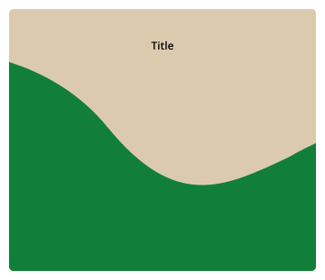
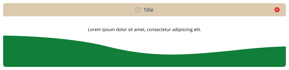
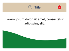
Field #DCCAAF · wave #117F39 · 8px radius. Titles in Open Sans — General title 600 (20px desktop / 12px mobile), “Oops!” 84px / 48px, “404” bold 100px / 60px in a #172E55 disc. Pop-up adds the standard drop shadow + red #ED1C24 close. On mobile the error layout stacks the disc above the “Oops!” block.
String field — Figma String / String (Large) · single-line or 350×100 multi-line (toggle “Large String Field” below) · Horizontal ⁄ Vertical · optional toggle, title & helper text · mandatory ⁄ error ⁄ inactive ⁄ non-editable
The standard single-line input. Its label row can carry an optional show ⁄ hide toggle (the library’s gold Show ⁄ Hide toggle — used when the field can be hidden from a given feature), an optional Title followed by a colon (the red asterisk sits between title and colon when mandatory), and an optional italic Helper Text line below. Horizontal puts the title beside the field, Vertical above it. The border encodes interaction — gray at rest, navy on hover or once text is entered, green while focused — while the text encodes validity (navy normally, red on error — an unfocused error field also takes a red #FF5151 border). A mandatory field that is still empty fills light red. Field 250×31 · radius 5 · Open Sans 14 · placeholder “Enter...” #8E8E8E. Borders — Default #BFBFBF · Hover ⁄ Text entered #172E55 · Focused #117F39. Mandatory + empty fill #FFE8E8 + red asterisk after the title. Error input text #ED1C24 · border #FF5151 when not focused (focus still turns it green). Inactive title, placeholder & toggle drop to #E0E0E0. Non-editable fill #ffffff + navy border ⁄ text; when empty it shows no box at all (an em-dash). Show ⁄ hide toggle = the library’s Show ⁄ Hide toggle (37×19, gold track + eye glyph; see Toggles). Helper text italic #8E8E8E. Two optional items — available on every field type and shown on every state specimen below: a placeholder end icon inside the right end of the bar, and a copy-field-text button to the right of the bar — 16px icon whose gray #E0E0E0 frame appears on hover with 4px top ⁄ bottom padding. {Title}, {Input Text} and {Helper Text} are placeholder text; toggle, title, helper, end icon and copy button are all optional.
Search bar field — Figma Search Bar · type-to-search field · single ⁄ multi selection · picks become Selected-Item chips · Horizontal ⁄ Vertical · mandatory ⁄ error ⁄ inactive ⁄ non-editable
A search field following the string field rules — optional {Title}: (red asterisk before the colon when mandatory), optional show ⁄ hide toggle, optional italic {Helper Text}, same border logic (gray navy on hover or once selected green focused red #FF5151 unfocused error; mandatory + empty fills #FFE8E8). The search icon sits at the right end of the bar and swaps by search type — general ⁄ user ⁄ properties (see Iconography Search); an optional icon placeholder can sit at the left end. The bar comes in two selection types, flagged by the tooltip marker after the title: single select ◎ — the chosen option renders as one Selected-Item chip inside the bar (a new pick replaces it) — and multi select — chips stack under the bar in series, filling the frame’s width before wrapping to the next line. Chips are the library’s Selected-Item standard (navy full-radius pill · tooltip icon · gold ⊗ to remove). Non-editable keeps the chips without the ⊗ on a #ffffff bar — or, with nothing selected, no bar at all: gray No {Title} Entered.
Bar 350 wide (vertical) ⁄ fluid (horizontal) · min-height 31 · radius 5 · magnifier 16px #8E8E8E right-aligned · optional 16px left icon placeholder · placeholder “Search...” #8E8E8E. Selection markers (after the title): ◎ single select · layered-check multi select — same glyphs as the field select legend. Borders — Default #BFBFBF · Hover ⁄ selected #172E55 · Focused #117F39 · Error unfocused #FF5151. Chips = Selected-Item standard: full-radius pill, 1px #172E55 border, tooltip icon, Open Sans 14, gold #DCCAAF 16px ⊗ (editable only); single = one chip in-bar, multi = chips in series under the bar, wrapping only when out of width. Inactive drops everything to #E0E0E0. Non-editable bar #ffffff + navy border, chips without ⊗; empty gray No {Title} Entered. End icon + copy button apply as on every field type.