Website Page Pattern
Fixed 60px navy top bar with a gold hairline + a collapsible ~264px navy sidebar + a scrolling cream workspace. Content centers at ~1480px. Multi-pane apps use CSS grid with fixed side columns and a fluid center.
Website page pattern — Top Bar Extended · Left Bar Extended (the general template)
Header Components
The building blocks of the omnipresent top bar — each header component and its pop-up window, as its own section. Sub-sections are collapsed by default; click a title to expand.
Global Header — full assembly (live)
Global header — omnipresent top bar · scope tabs · search + Search My Location · filter “jelly beans” · Save Search / notifications / profile
Live preview embedded from Website Page Pattern.html — always in sync with the interactive build. Toggle “Condense Top Bar” there to switch states.
The header is omnipresent — it appears on every public and signed-in page and adapts to who is logged in. The left column holds the logo over the account card (avatar + name + role when signed in; a Log In / Join in the account card when logged out). The main column stacks four rows: a scope row — the Purchase / Lease transaction toggle, the gold-bordered scope bar (Residential / Commercial / Land / School / Brokers & Agents, gold = active) that retargets what the search looks through, and the Language / Unit pickers pushed to the right; the search bar (white pill) holding the selected-item chips, a #BFBFBF divider, the placeholder, then Search My location (navy outline), Clear Search (red), the green Listings updated status, and the gold Search button; the filter row — led by the green listing-update jelly bean (red dot = new) through Property Type, Price Range, Beds & Baths, MLS Number, Stories, Home Size, Open House, Timeframe, closed by Adv. Filters (gold outline) + Save Search (gold); and a right-aligned Condense Top Bar collapse. Login state and the DesktopMobile preview are driven from a discreet Dev strip, which is tooling and never ships as production chrome.
Header #172E55 with the gold underline rule · search pill #FFFFFF / full-radius · account card white / 12px radius · scope bar gold-bordered, active tab gold · filter beans rgba(255,255,255,.07–.22) on navy.
Condensed (single row). “Condense Top Bar” collapses the header to one row: the scope tabs and filter beans hide and the search bar moves up inline, beside a compact logo and a pill-shaped profile chip (avatar + contact-type bean, or avatar + Log In / Join when signed out). Chip geometry: the white frame is a full-radius pill wrapping the contact-type bean with 3px vertical / 6px horizontal padding; the 48px circular avatar sits behind the frame (z‑index below it), overlapping its top edge by 15px so the visible crown of the avatar is 33px (48−15). Signed out, the same white frame holds the words Log In / Join as plain text — Open Sans, regular, contact-type size (13px), PURE Primary Blue — with no button border, fill, or shadow. The control flips to “Expand Top Bar.” Signed-out card: the avatar tucked behind the white account card, with Log In / Join as plain text inside it — Open Sans, regular, PURE Primary Blue — no inner pill, border, fill, or shadow (one frame, not a frame within a frame).
Header Card — account card · composes the Contact Type bean
Header Card — the account card in the header · pick a profile to preview
The account card adapts to who is signed in. When a user has no profile image it falls back to the PURE person glyph in a rounded tile — the fill inverts by state: logged out = white tile with a gold glyph; logged in = gold tile with a white glyph. A real photo (cover-fit) replaces it the moment one exists. Choose a profile below to see the Extended and Condensed bars for that identity.
Tile radius 16 / 112 (≈14%) · gold #DCCAAF · glyph white (in) / gold (out). In the header card the 112×112 tile overlaps the white card by 34, so the top 78px stays visible above the card (112 − 34 = 78). Card padding 10×6 · name in Navy 500 Regular at MD (16px), contact-type bean 3px under it, the name/type block 10px from the notification bell. Condensed collapses to a full-radius pill: 48px avatar overlapping the frame by 15px (33px crown visible).
Search Scope Tab — gold-bordered scope bar in the header
Lives in the navy header. Gold #DCCAAF 1px border · 360px pill · tabs split by 1px rgba(255,255,255,.45) separators. Friend view shows the property categories as separate tabs; Agent & above collapses them into a Property Type dropdown and adds Records. Matches the live .scope bar in Website Page Pattern.html.
Pop-up · Search Radius — opens from “Search My Location”
Search Radius popover — Figma Search My Location · opens from the “Search My Location” control in the global search bar
Opens from Search My Location in the global search bar; the gold caret points back at the trigger. Header: gold #DCCAAF · Open Sans Regular 16px navy title · red #ED1C24 circular close. Body white, 6px radius, 12/15 padding. The radius select uses the primary gray-gradient surface (white#E0E0E0, #F3F3F3 hairline, navy chevron) and drops the 280px dropdown below it — 39px rows split by #BFBFBF hairlines; the hovered / selected row turns green #117F39 with white text (per the dropdown standard). All text is Open Sans Regular. Actions pair Clear (destructive normal — #FF5151 outline + text on white) with Done (validation — solid #117F39, white text) at ~120:130 width. The mobile variant is identical with 36px dropdown rows and the caret shifted toward the right-aligned trigger.
Pop-up · Language — language picker
Opens from the Language control in the header. Gold header, red circular close, scrolling list of languages — each a flag + name; the current language is the green selected row; hover fills gold.
Pop-up · Units — unit picker
Opens from the Units control. Choose a measurement system (Imperial / Metric — green selected radio row), its area unit, and the currency.
Pop-up · Main Filters — a main filter’s selection window
Pop-up window design to be added. Send the design and I’ll build it as a daughter of PURE.window.
Pop-up · Advanced Filters — the full advanced-filters panel
Pop-up window design to be added. Send the design and I’ll build it as a daughter of PURE.window.
Pop-up · Save Search — name & save the current search
Pop-up window design to be added. Send the design and I’ll build it as a daughter of PURE.window.
Left Bar
The role-scoped vertical navigation rail — two display modes (desktop · mobile) and two themes (light · dark).
Live component embedded from components/leftbar/ — the same renderer the Website Page Pattern uses. Hover the collapsed rail to expand; the middle rail is pinned open; the third shows the dark theme.
Window Sections
The open-windows strip sitting flush on the top edge of the white window — active tab in solid Gold 500, inactive tabs outlined; includes the “see all extra windows” dropdown.
A browser-style strip of open sections sitting flush on the top edge of the white window; the window keeps a 20px inset on all four sides. The active section is a solid Gold 500 tab; inactive sections are white with a 2px Gold 500 outline. Each section tab reads lead icon · title · close ×. The bar holds two button types: the window button (an open section — lead icon · title · close ×, idle white active gold) and, when too many windows are open, a narrower See all extra windows button (⌄ chevron, no lead icon) that opens a dropdown to pick one of the hidden windows into the bar. The body below renders the open section's content — its in-window tabs and title are documented next.
white · 2px Gold bottom rule
Gold 300 #EADFCF
Gold 500 #DCCAAF
white · 2px Gold bottom rule
Gold 300 #EADFCF
Gold 500 #DCCAAF
white · 2px Gold bottom rule
Gold 300 #EADFCF
white · 2px Gold bottom rule
Gold 300 #EADFCF
into the bar
The See all extra windows button only appears once the open windows can no longer fit. Desktop: it shows the moment the next window won't fit the bar's width — windows never wrap or shrink, they spill into the dropdown. Mobile: it shows past 5 open windows; windows 6+ live in the dropdown. The bar itself also scrolls horizontally on mobile.
States
#EADFCF fill Selected — Gold 500 #DCCAAF fillThe 2px bottom rule stays Gold 500 in every state, so it always lines up with the strip's own rule. Both types share these three states.Anatomy
Placeholder icon — navy 500, 24px desktop / 14px mobile
Label — Typography XL, 20/27 desktop · 12/16 mobile
Close — remove icon, 8px desktop / 6px mobile, Black Red 1
#ED1C24 on hover, no frameChevron — resize-down 10×5, Type 2 only
Geometry
Radius 5px on the two top corners only
Lead frame close icon gap 20px (10px mobile)
Shadow 5·5·10 / .10
Strip lays buttons leftright, 10px gap, on its own 2px Gold 500 rule
Pop-up / overlay windows — Figma Full Window · the canonical overlay anchored to an action button or info trigger · gold title bar + red close · body sized to content
The standard surface for anything that opens over the page from a button or info trigger — menus, short forms, confirmations, detail panels. A caret ties it to whatever opened it; a gold title bar carries a centred icon + title with a red close on the right; the white body holds the content. Width and height flex with the content — keep it modest and always fully visible inside the page (never bleeding past the viewport).
Window #FFFFFF · 5px radius · 5/5/10 · 10% shadow. Title bar #DCCAAF, 42px tall (38 mobile). Caret 22×11 gold, centred on / aligned to the trigger. Title centred — placeholder icon ~16px + Open Sans 16 navy #172E55. Close 16px red #ED1C24 circle with white ×, inset 18px from the right edge. Body padding 18/22 (14/16 mobile), Open Sans 14 #404040.
Width and height are driven by the content, not fixed. Keep the window modest and ensure it stays fully within the page — if content is long, it scrolls inside the body (vertical before horizontal) rather than growing past the viewport.
Related variants build on this same shell: the 250px dropdown pop-up (caret + gold header, option list, no title row) and the info-display pop-up (gold field + green wave). Both inherit the caret, gold header and red close documented here.
Field-info pop-up (tooltip) — Figma Definition / Calculation / Suggesting / Requesting Help Windows · the overlay opened by a field's ⓘ tooltip trigger · one shell, four states
Every field that carries a ⓘ tooltip icon opens this pop-up. It is the standard overlay window — caret, gold title bar, red close — where the title is the field name prefixed by the same ⓘ glyph. It has four states the user moves between in place: Definition (default), Calculation, Suggesting Something, and Requesting Help. Width is the standard ~450px; height flexes to content.
The Definition ⁄ Calculation tab row appears only when the field is itself the result of a calculation of other fields (e.g. several MLS fields combined). Both tabs split the window width in half (50 ⁄ 50). For a plain, non-calculated field there is no tab row — the body opens straight into the definition. The active tab is navy + bold with a 4px navy underline; the inactive tab is gray #999999 with a thin #BFBFBF underline, divided by a short vertical hairline.
Click the tabs and action buttons below — the same window moves between all four states in place. Toggle whether the field is calculated to show or hide the Definition ⁄ Calculation tabs.
The three gray-gradient buttons (see button library) are constant across Definition & Calculation. See more info on this field (full width) navigates to that field's page in the Real Estate Dictionary. Suggest Changes switches the same window to state 3; Request Help switches it to state 4. Both 3 & 4 share a free-text box plus a red-outline Cancel and a green #117F39 submit (Suggest Change ⁄ Request Help) that returns to the field.
Trigger ⁄ title icon ⓘ — navy #172E55 outlined circle, italic serif i. Definition body 14px #404040; cross-reference links + Source are navy underlined; TF (Trust Factor, %) is bold-labelled and computed from the field's source(s). Image area is optional — when a field benefits from a supporting image it sits on a #767676 block; otherwise it is omitted and the body closes straight to the action buttons. Calculation body lists each input field (bold label + value) and shows the formula as a built-up fraction. Submit buttons fill the green #117F39; Cancel is a red #ED1C24 outline.
Full-Window Overlay
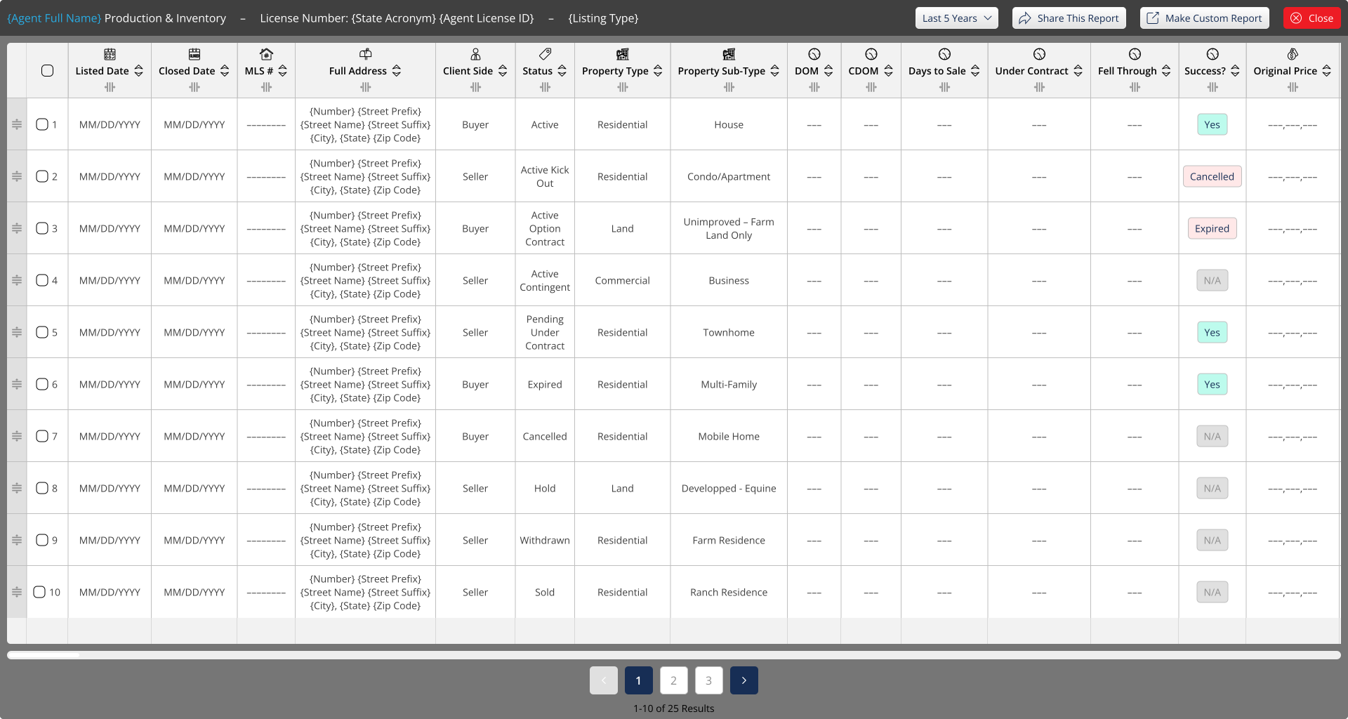
A near-full-viewport overlay for viewing a large artifact in place — a table ⁄ report (horizontal scrolling) or a document ⁄ PDF (vertical scrolling & page selection). Dark chrome frames a neutral #767676 content surface; the variant only changes the navigation controls.
Both variants share one shell: a 44px dark #404040 title bar — title in white, an en-dash, then a breadcrumb ⁄ link in any link color (#29ABE2 shown), a right-aligned gray-gradient Label Text action and a red Close — over a #767676 body that hosts the artifact. The whole surface has a 5px radius and sits over the dimmed app.
Horizontal for wide records that scroll sideways — tables, reports, spreadsheets — paired with numbered pagination and a “n-n of N Results” count. Vertical for paged documents — PDFs, printouts — paired with a Page n ⁄ N jump field and a zoom −⁄+ control. Use the overlay only for artifacts too large for an in-window section; everything else stays in the normal window.
Surface #767676, 5px radius. Title bar #404040, 44px — white title + en-dash + link-colored breadcrumb; right cluster = gray-gradient Label Text (flanked by ⓘ) + red Close #ED1C24 with white disc. Scrollbars #EFEFEF track + white thumb (12px). Pagination — active page Navy #172E55 ⁄ white; idle pages white with #BFBFBF border ⁄ #8E8E8E text; arrows in #E0E0E0 (prev) and Navy (next). Page selector on a rgba(64,64,64,.8) bar.
The same shell carries very different artifacts — only the toolbar and scroll ⁄ page controls change to fit the content.
In-Window Tabs & Titles
Inside an open window, navigation nests up to three levels plus a side rail — primary · secondary · side · mobile.
Inside an open window, navigation nests up to three levels plus a side rail. A section's subsections render as the primary tab bar; deeper views use secondary underline tabs, an optional stacked second row, and a vertical side tab bar. A gray record title band sits directly beneath whichever bar its title belongs to — between the primary and secondary rows when the title is tied to the primary tab, below the secondary row when it is tied to the secondary tab, and below the side rail’s heading when it is tied to a side tab.
transparent · Gray 550
Navy 100 · Navy 500
Navy 500 · white · 600
Equal-width segments on a white rounded bar; the active segment is Navy 500 with a white icon + label; inactive segments are gray, divided by thin rules.
Mobile 1 (m-tab-2.svg) is white with a 1px Navy 500 border and 5px radius; Mobile 2 (m-tab-3.svg) is the second secondary tab of the same window — Gray 50 fill, navy top + bottom rules, no radius, Gray 500 ink. Both open a mobile-spec PURE.dropdown at the button width, 3px below, carrying every option of the desktop strip.
Gray 550 icon · #999 label
Navy 500
Navy 500 · 600 · 2px navy rule
icon picker · PURE.field title · trash
rule only
PURE.buttons.primary instance
input + navy plus
PURE.buttons.validation instance
Tabs sit on a shared 1px #BFBFBF bottom rule. Default label #999999 · Gray 550 icon; Selected is Navy 500 · 600 with a 2px navy rule. The Extra segment fills the remaining width — empty, or carrying the Edit Information button, the Add-New-Section field, or Cancel + Save Changes.
transparent
Gray 200
Gray 300
1px Gray 600
Gray 100 fill
2px border
#ffffff, 1px Gray 450 border, 10px padding) · button 180×39, 5px radius, Open Sans 14 #404040. Mobile pill hugs its label, 41px tall, full radius (360px), 10px padding all round, 11px apart, row scrolls horizontally.The data-bearing band naming the open record — inline pencil to rename, trailing ID. Sits between the primary tabs and the secondary row. Right-aligned actions are PURE.buttons.primary instances — Edit (edit icon) and Back (back icon).
A title band that names a window. Window Title (main) — a #F2F2F2 bar, 5px radius, 42px tall, centered title, no border — titles the whole main window. Small Window Title (inner) — the same bar with a 2px #404040 bottom rule — titles a smaller window nested inside the main one. The record title band is the data-bearing variant of this band: it names the open record (with inline rename + ID) and may carry right-aligned action buttons, which are PURE.buttons.primary instances.
A horizontal step tracker for any multi-step process (onboarding, a wizard, a checkout). Each step is a pill carrying a numbered circle + label; the # is a placeholder for the step number. Steps run inside one white container — 16px radius, #BFBFBF hairline, down-right shadow.
Default — no pill fill; #F2F2F2 circle + #8E8E8E number & label (a step not yet reached). Hover — #F9F7F4 pill, navy label. Selected — navy #172E55 pill, gold #DCCAAF circle with navy number, white label (the current step). Done / Success — green #117F39 circle with white check, green label (a completed step).
Once a step is active, three pieces work together: the main window holds that step's content, the action bar tracks progress + carries the move buttons, and the live preview card summarises what's been entered so far. All three share the card shell — 16px radius, #BFBFBF hairline, down-right shadow.
Main window — navy #172E55 header with a gold #DCCAAF uppercase STEP ## eyebrow + white step title; the body lists the step's fields, each lettered in a gold circle and split by dotted rules. Action bar — left reads Step # of # with the auto-save stamp; right carries the move buttons: Previous & Next are #E0E0E0 secondary pills with the navigational arrow circle (#BFBFBF, white 1px arrow), and the primary Save Draft is the gold pill. Live preview card — same navy header (LIVE PREVIEW eyebrow + title); body stacks label · value rows on dotted rules, summarising entries as the user advances.
The same step tracker can be reused inside a window section as a secondary process bar — a sub-process tied to the primary one. It uses the identical pill states (selected = navy #172E55 pill, gold #DCCAAF circle, white label; the rest = #F2F2F2 circle + #8E8E8E label) but sits in its own rounded #BFBFBF container within the section body rather than spanning the window top.
Separations & Scroll Bars
The rules, brackets and toggles that carve a window into regions — plain dividers, expandable section toggles, related-info brackets, and the custom scrollbar.
Dividing lines — Figma Type=Line / Dotted Line · Horizontal & Vertical · the plain rule that separates two regions
A single hairline in #BFBFBF with round caps. Solid is the default separator; dotted (2px on / 2px off) marks a softer or provisional split. Each runs both ways — horizontal between stacked blocks, vertical between side-by-side columns.
Stroke #BFBFBF · 1px · round cap. Dotted dash 2 / 2. Horizontal rule stretches to its container; vertical rule defaults to 115px and stretches to the region height.
Expandable separators — Figma Type=See More / See Less / Description · a clickable pill straddling the divider that opens, closes or jumps a content region
The pill is a PURE.buttons.secondary instance sitting centered on a #BFBFBF hairline, carrying a Small Arrow icon instance on each side + a label. See More (down chevrons) reveals hidden content; See Less (up chevrons) collapses it again. Description is the same control with an editable label — use it for a directional action such as “Go to {location}” or to summarize / label a whole zone above or below the line (e.g. a conditional-logic outcome), with the chevrons pointing at the region the label refers to.
The pill is a PURE.buttons.secondary instance — #E0E0E0 fill, navy label — with a full 360px radius as a user-approved exception to that variant’s own 5px radius, centered on the #BFBFBF hairline. Both arrows are Iconography › General › Arrows › Small Arrow instances in the button’s ink. Chevron direction = action: down reveals, up collapses. Description carries free text and may point any direction it needs. As a zone label the chevrons point at the region the text summarizes — up for the zone above, down for the zone below — and the pill simply describes that zone (e.g. a conditional outcome) rather than expanding it.
A collapsed activity log. See More reveals the hidden rows; See Less collapses them back.
09:14 amUpdated Notification Preferences — from Dashboard
09:02 amTCPA-Compliant Consent signed
Related-info brackets — Figma Type=Related Info w/arrow + Related Info · a top-and-bottom pair that fences off an explanatory note tied to a feature
A heavier 2px black bracket, always used as a pair. The arrow piece goes on top — its solid triangle points up at the feature being explained — then the note copy, then the plain piece closes the area beneath. Together they fence an inline explanation to whatever the arrow targets.
Stroke 2px #000000 · round cap. Triangle 16×8, apex up. Order topbottom: arrow · note · plain. The heavier black weight sets these apart from the gray #BFBFBF structural dividers.
The bracket geometry is always the same 2px pair — the stroke colour and note inside both shift to signal intent. Three uses:
Red 1 #ED1C24 · compliance / validity alerts.
Gray #8E8E8E italic · soft, non-blocking guidance.
 my-document.pdf
Text with images, logos, icons or attachments — for high-importance detail.
Scrollbars — Figma Orientation=Horizontal / Vertical · the custom track + thumb used on every scrolling region
#EFEFEF12px · pill#FFFFFF6px · pill · 3px inset#748299, thumb Navy-100 #D1D5DD · same 12px / 6px / 3px-inset geometry as light#74829912px · pill#D1D5DD6px · pill · 3px insetA 12px pill track in #EFEFEF carries a 6px white pill thumb, inset 3px on every side, with a 100px minimum length. The vertical bar is the same geometry rotated 90°. Apply it to any overflow region — window bodies, dropdown lists, horizontally-scrolling tab bars — so the real scrollbar matches this spec instead of the browser default.
Footer
Exact artwork from the source files — gold contact band, navy body, Schedule-a-Meeting buttons, legal links, social circles. Desktop · mobile · mobile action bar.
Exact artwork exported from the source design files. The gold contact band, navy body, Schedule-a-Meeting outline buttons, legal links, social circles and copyright bar are fixed; only the wordmark photo backdrop varies by page.
Mobile-only, fixed at the bottom: a navy bar of five slots with a raised green circular action over the center slot. The slot set changes with who's logged in — the center action is Contact Us (headset) for logged-out, broker, association & MLS, and the assigned agent (photo + name, e.g. Shana Acquisto) for friend & agent.
Field select legend — optional window-footer note · decodes the single-select vs multi-select field markers · Open Sans italic #8E8E8E on a #BFBFBF hairline
A one-line note that may sit at the bottom of a window when its form mixes field types. It pairs each tooltip marker with its meaning: the concentric-circle icon marks a single-select field, the stacked-copy icon marks a multi-selection field. The whole line is Open Sans italic in #8E8E8E, riding a 1px #BFBFBF hairline. Desktop keeps it on one line at 14px; mobile drops to 12px and wraps after the second marker.
Description Window
A general-purpose collapsible panel that holds the long-form description of whatever a page is about. It sits at the foot of a page, ships collapsed, and expands in place to reveal a titled description with optional imagery and tag chips. It is not tied to any one record type — use it for a building, a program, a listing, or anything else that warrants a written description.
The specimen below is one concrete use — a neighborhood description on a property-search results page. The copy, tags, and image are specific to that scenario; the component itself is generic.
Collapsed (Reduced)
#9CB2C1 fill · #BFBFBF hairline · 42px tall · centered navy title · down-chevron at the right edge.Expanded (Extended)
#ECF9FF body holding numbered, titled sub-sections with optional image + tag chips.Anatomy — Header: #9CB2C1 bar, #BFBFBF border, 42px, centered navy title, chevron toggle (pill radius when collapsed; top-rounded when open). Body: #ECF9FF; each part is a numbered title followed by copy. The first part may pair a 320×180 image (radius 5) on the left with a tag-chip row — chips are #FFFFDC pills with navy text. Inline links use #29ABE2 underlined.
One Description Window per page, and only at the foot. It explains the single thing the page is about — whatever that record happens to be. Always ship it collapsed so it never competes with the primary content above it.